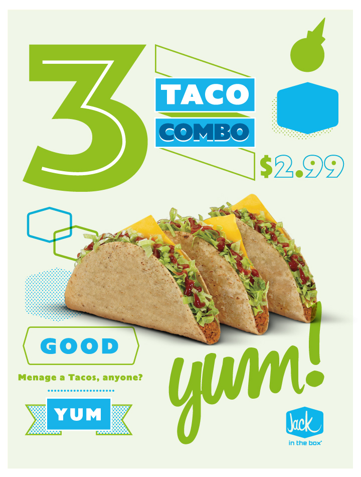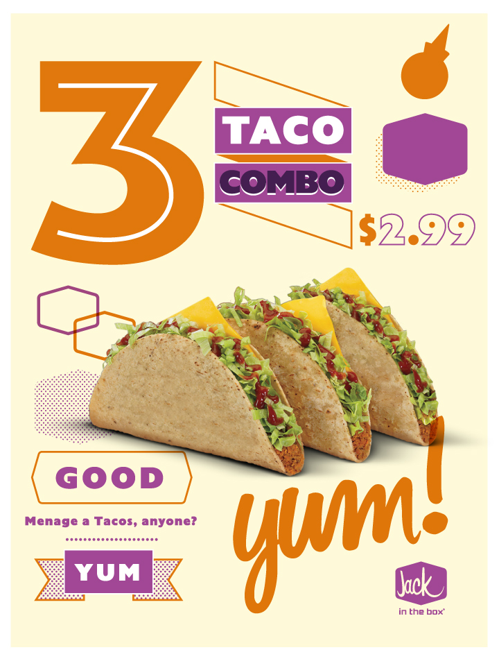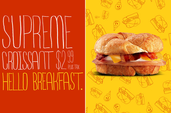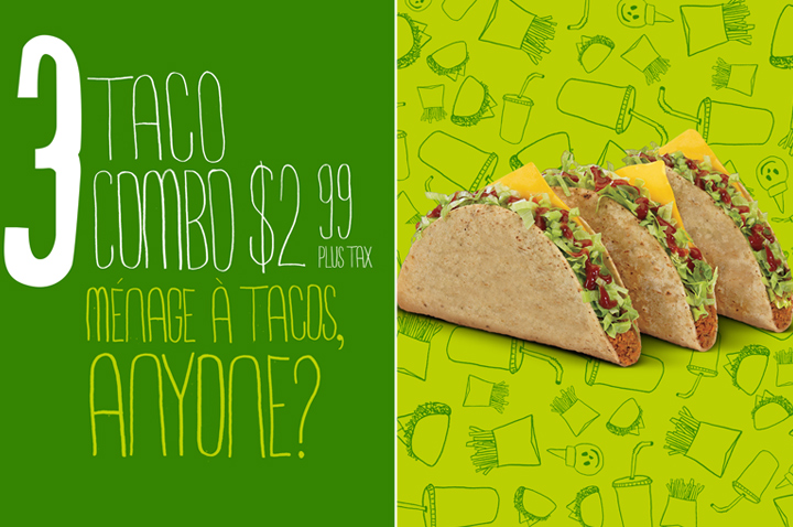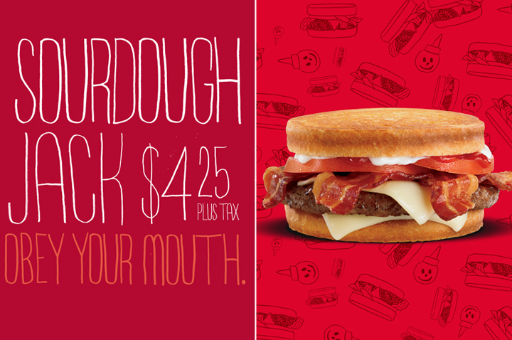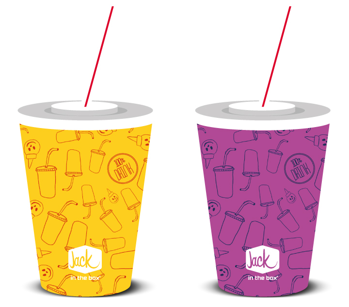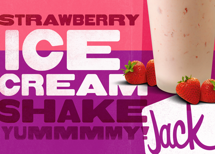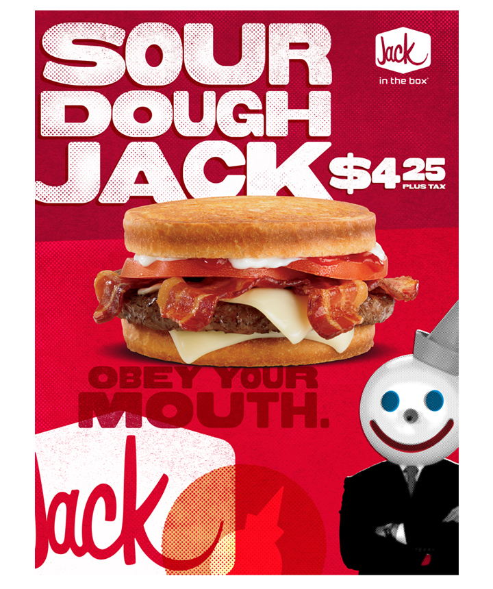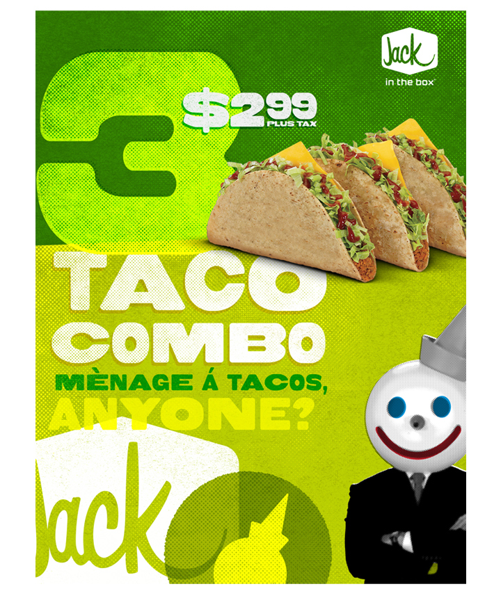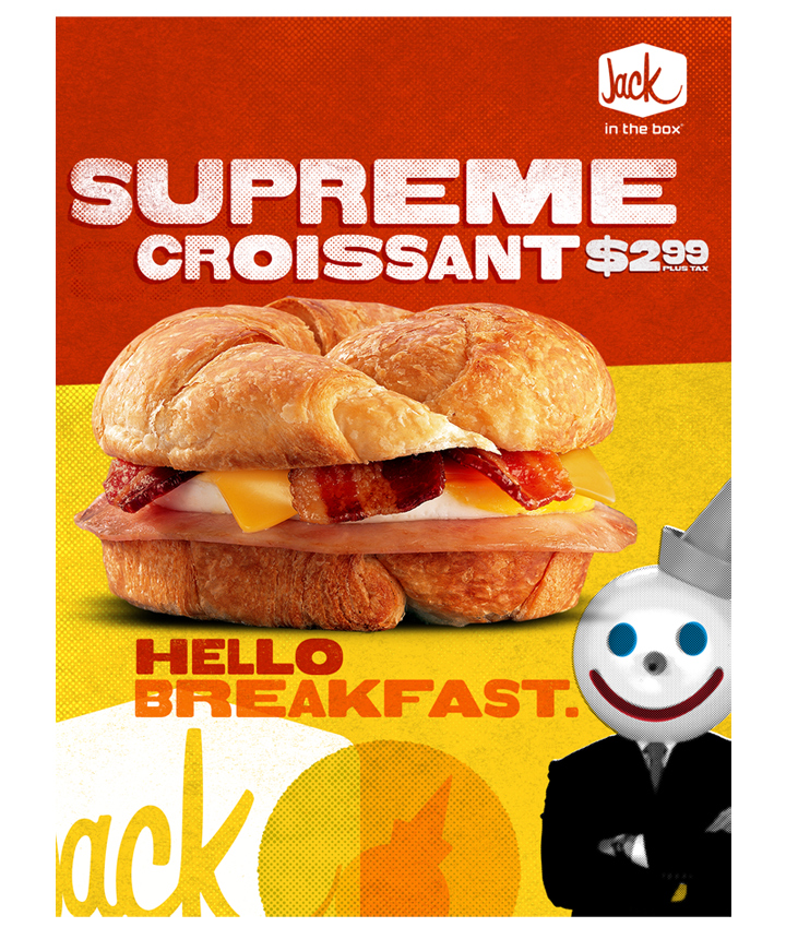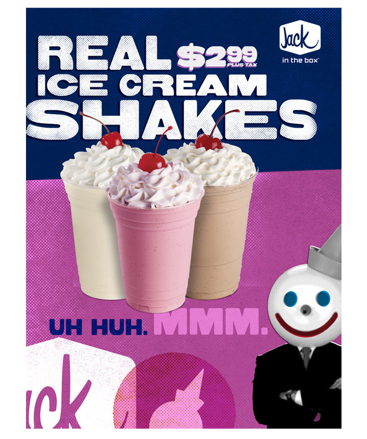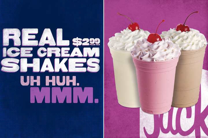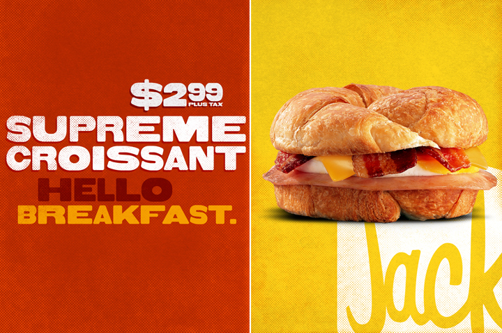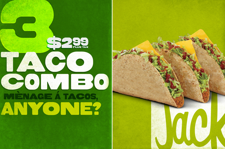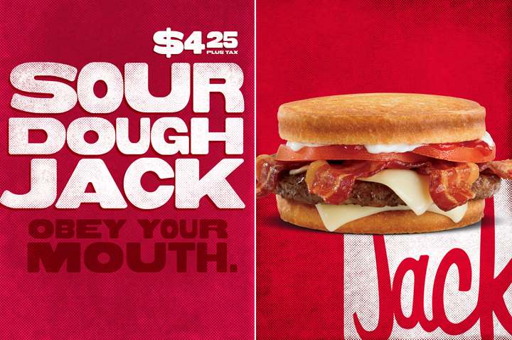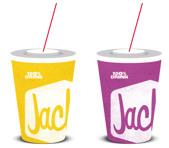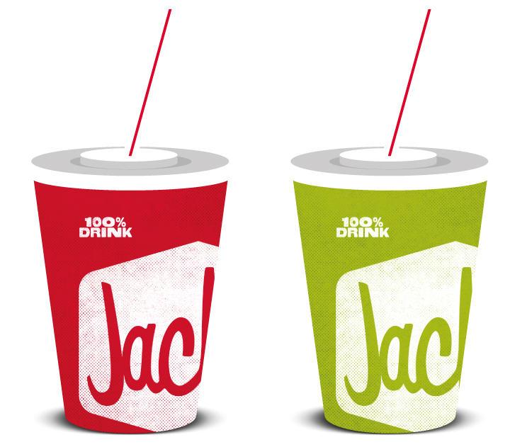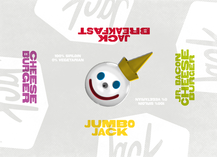
I don't eat a whole lot of fast food, but when I had the chance to work on a rebranding effort for Jack in the Box I just couldn't resist. Known for their wacky big head spokesman Jack, the West coast chain was due for a serious make-over across the board. Not too long ago they released their new dimensional logo designed by Duffy & Partners. However, since that logo update much of the chain's other collateral started to become inconsistent in look and feel.
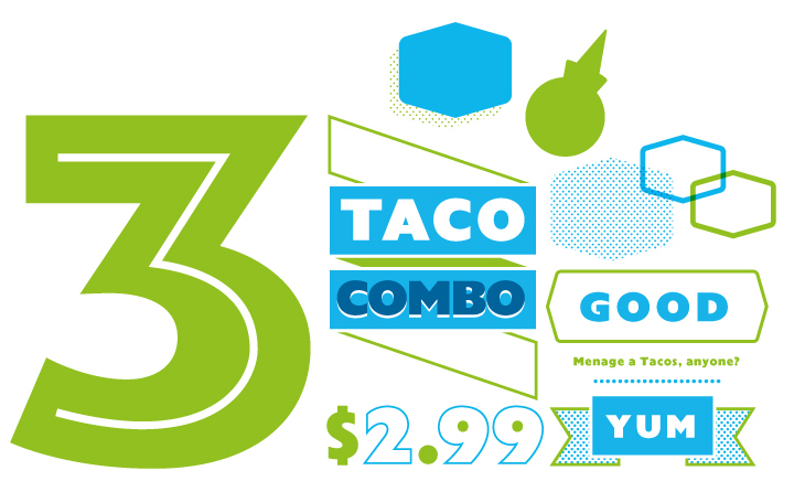
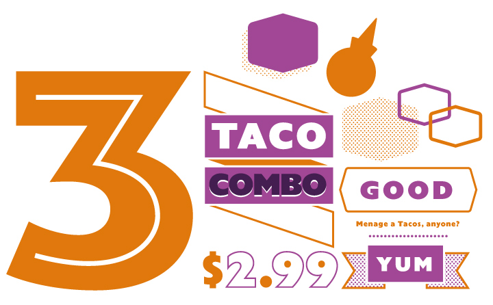
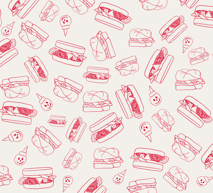
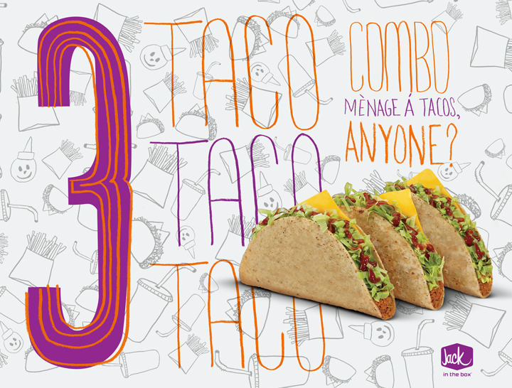
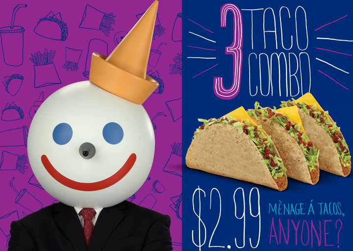
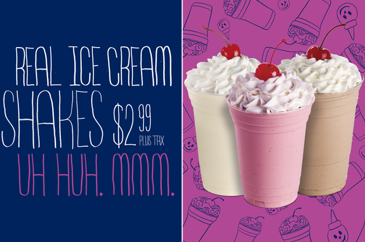
Partnering with Secret Weapon I created several new look explorations that plays off their kooky appeal. They included everything from posters, to advertising, cups, burger wrappers...etc. A very fun project and below is a sampling of a few directions.

ROLE // Design, Illustration
AGENCY // Secret Weapon

